

Hudson Jets is a private aviation membership brand. The brief had two non-negotiables: a clean, minimalistic design — nothing aspirational, nothing performative — and a full handoff in 72 hours. Three days from kickoff to a finished site. The constraints were the brief.
Why speed wasn't a compromise
The instinct in private aviation web design is to take six to twelve weeks. There is always more research to do, more photography to source, more positioning to refine. Most of it is real work. Some of it is hesitation dressed up as process.
Hudson Jets didn't need any of that. The brand had a clear offer — a jet membership program. The voice was already set. The audience was specific. What the project needed was someone to make the obvious decisions quickly, and ship.
72 hours forces clarity. It strips out every conversation that should have been an email. It removes the round of feedback no one needed. It tells you, very fast, which design decisions matter and which ones were always going to be discarded.
Why minimalism wasn't a style choice
Most private aviation websites look the same because they are built around the same default: a hero video of a jet, a paragraph of brand-poetic copy, a CTA that says request a quote. The vocabulary is borrowed across the category, so the visual register ends up borrowed too.
Hudson Jets needed to read as a serious operator without the visual cost of joining the club. Clean type. Restrained motion. White space. The membership program treated as the product, not a sub-page.
The minimalism wasn't an aesthetic decision. It was a positioning decision. A site that doesn't shout reads as a brand that doesn't need to.
How the site is structured
- The membership leads. What it is, who it's for, what it includes — stated clearly on the homepage, not buried behind a click.
- Inquiry flow built for membership intent. Three or four fields, framed for someone who already knows they want in.
- Photography used sparingly. One or two shots that earn their place. No filler.
- Type does the work. The brand is carried by the typography. The photography supports it. Not the other way around.
What 72 hours teaches you
The lesson isn't that every project should ship in three days. The lesson is that most of the time we add to a project is overhead, not value. When the brief is clear, the team is small, and the decisions are made quickly, three days is plenty.
It's the difference between a project that takes a long time because the work is genuinely difficult, and one that takes a long time because no one in the room is willing to make a call.
See the site
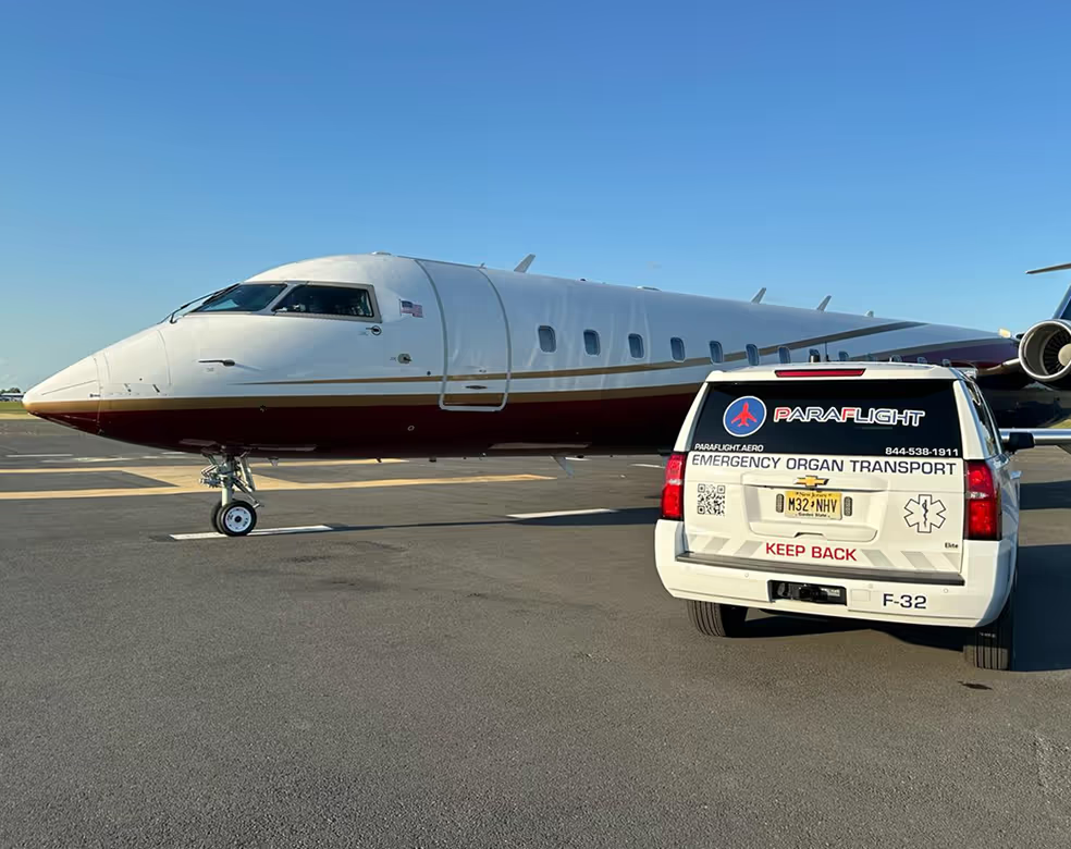
Live at hudsonjets.com. For other private aviation projects we've worked on, see JetSet GRP, Reliance Jets, and Paraflight. For more on web design for the category, read Web design for luxury brands: what actually matters.
Frequently asked questions
How long does it take to design a private aviation website?
When the brief and content are settled, days. We designed, built, and handed off the Hudson Jets membership site in 72 hours. When positioning is still forming it takes longer, and that time is better spent on strategy than design.
What makes a private jet membership website different from a charter site?
A membership site is organized around the program — tiers, benefits, and how someone joins — not a quote form. The homepage sells belonging, not a single flight. We build both, and the structure is different from the first wireframe.
Who designs private aviation membership websites?
beterdesign has built for six private aviation brands, including Hudson Jets, JetSet GRP, and Reliance Jets. That depth is why we can move fast without guessing at what the category needs.
.svg)