


In private aviation, the prospective client has already decided whether they trust you before the first call is made. The decision happens on your website, from your email signature, from the card you hand to the FBO manager. Brand identity is not the thing clients notice — it is the thing they feel without noticing, and it shapes every interaction that follows.
The brands that understand this do not try to communicate their value through adjectives. They communicate it through precision. Through restraint. Through the weight of a piece of paper and the spacing of a letterform.
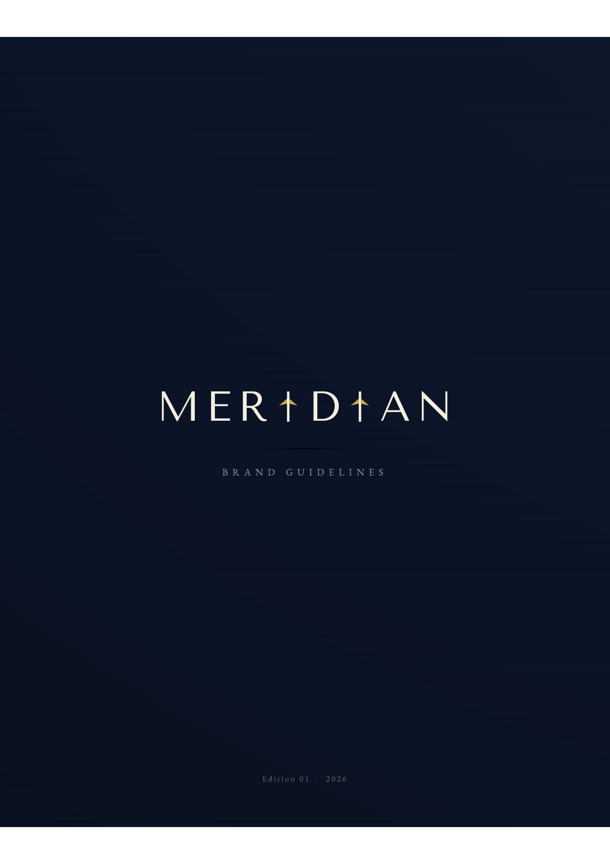
To make this concrete, we built MERIDIAN in our studio — a private aviation brand concept developed to illustrate exactly what this kind of discipline looks like when applied from the ground up.
A private aviation house built on restraint
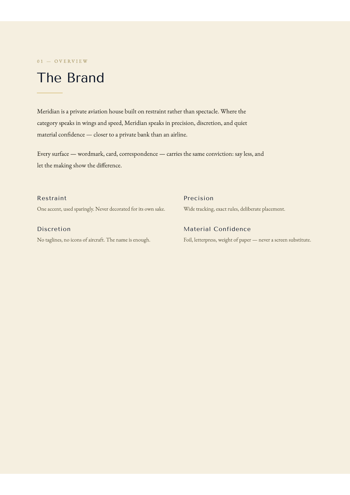
MERIDIAN's brand brief opens with a single sentence: Meridian is a private aviation house built on restraint rather than spectacle. Where the category speaks in wings and speed, Meridian speaks in precision, discretion, and quiet material confidence — closer to a private bank than an airline.
Every surface — wordmark, card, correspondence — carries the same conviction: say less, and let the making show the difference.
This is not a philosophy about minimalism. It is a positioning decision. In a market where competitors stack certifications, fleet counts, and safety statistics onto every page, the brand that says nothing but communicates everything occupies a category of one.
Four decisions that define the brand
The MERIDIAN brand system is built on four pillars, each of which is a design constraint as much as a brand value.
Restraint. One accent, used sparingly. Never decorated for its own sake. The Meridian Gold appears only as a rule, a wing, a foil edge — never as a fill, never as a background.
Precision. Wide tracking, exact rules, deliberate placement. Every element on every surface is placed with a reason. Nothing floats. Nothing is approximate.
Discretion. No taglines, no icons of aircraft. The name is enough. Most aviation brands cannot resist the silhouette of a wing or the arc of a globe. MERIDIAN has neither. The wordmark and the gold rule are the only ornaments.
Material Confidence. Foil, letterpress, weight of paper — never a screen substitute. The brand is designed for physical materials first. When it translates to screen, it carries the same weight because it was never built for screen cheapness to begin with.
The wordmark system
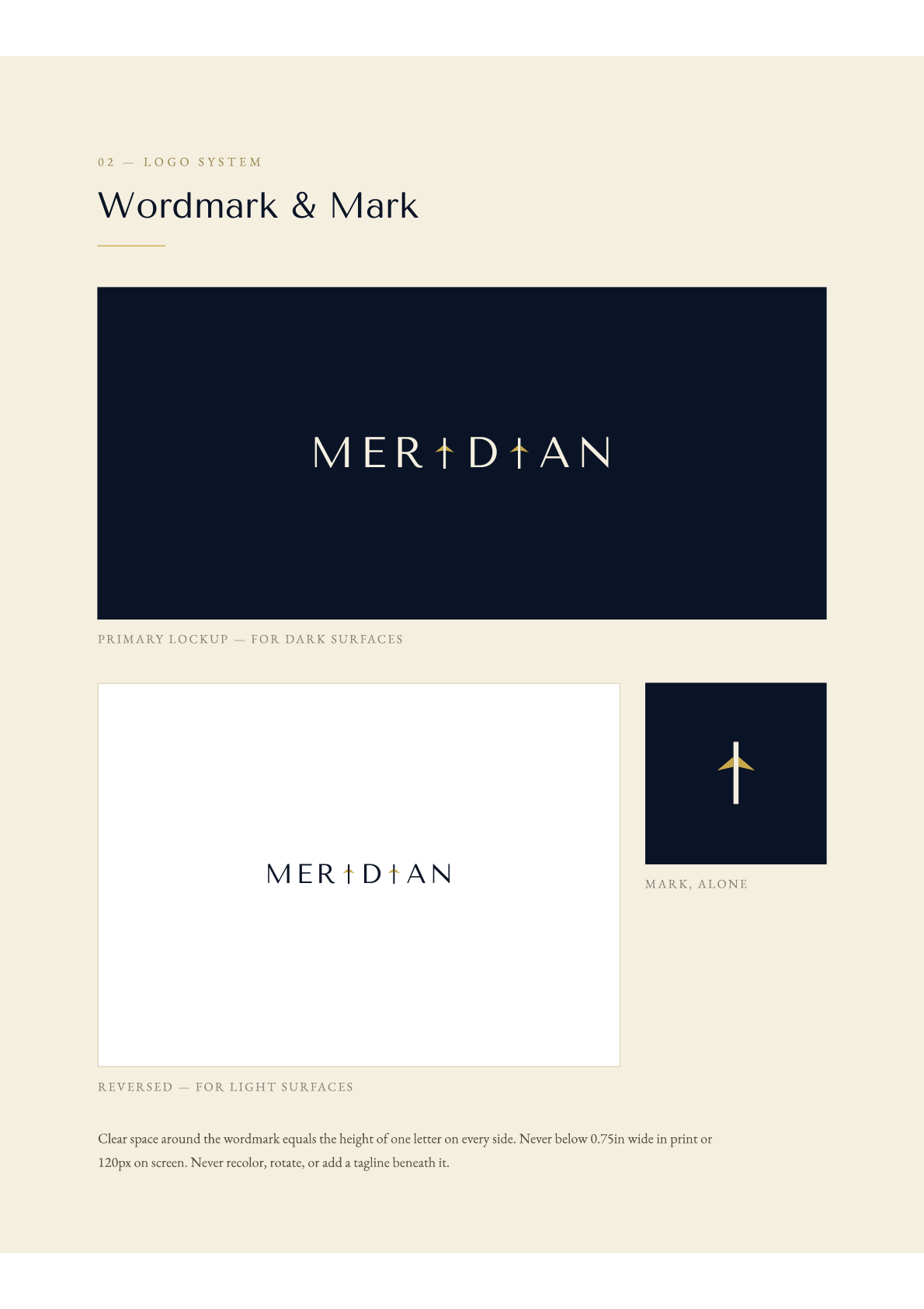
The MERIDIAN wordmark is set in Tenor Sans — wide-tracked, never bold, never condensed. The two I characters are replaced by the Meridian mark: a vertical stroke with swept-back gold wings. Three versions exist: primary on Midnight Navy (#0B1426), reversed on Parchment (#F5EFE0), and the mark alone. The mark never appears twice on the same surface.
The color system
Three colors. No secondary palette. Midnight Navy (#0B1426) covers at least 70% of any application. Meridian Gold (#C9A84C) appears only as a precise accent: rules, wing marks, foil edges — never a fill. Parchment (#F5EFE0) functions as paper stock and as type on dark surfaces.
What this means for a private aviation website
MERIDIAN translated to a Webflow website would not look like any other aviation website currently online — not because of decoration, but because of absence. The homepage would carry the wordmark and a single sentence. The fleet section would show photography that looks nothing like press releases. The contact page would not have a form with fifteen fields.
This is the conversion mechanism most aviation companies do not understand: the prospect deciding between two operators of equal capability will choose the one whose website makes them feel understood before they say a word.
This is what we build at beterdesign — for PLS Aviation, founded by Jim Pyne, NFL player and Wheels Up co-founder; for Hudson Jets; for JetSet GRP; for Reliance Jets; for The Jet Network, founded by Dean A. Kantis with over $400 million in aircraft transactions. A private aviation website design agency and Webflow Certified Partner that starts with the brand architecture and ends with a site that operates as a conversion tool, not a brochure.
If your brand is not doing the work it should
If you are a charter operator, charter broker, aircraft acquisitions firm, or FBO — and you know your current website and brand are not matching the quality of what you deliver — we should talk. The first step is a conversation. We look at what you have, who you are trying to reach, and what the gap is costing you.

.svg)