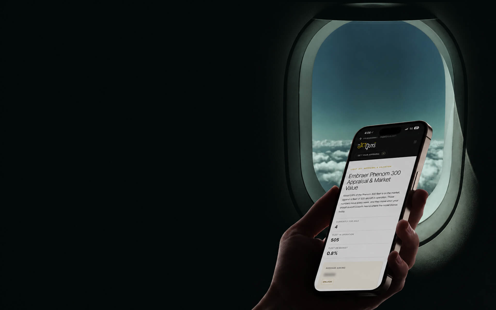



Most private aviation websites lose clients before the first call. Not because the operation is weak, but because the site quietly tells the wrong story. A charter client deciding where to spend $40,000 reads the website the way they read a crew: in seconds, and mostly on instinct. If the site looks like it was built once and forgotten, the instinct is that the operation might be too.
We've built for six private aviation brands at beterdesign, including Hudson Jets, Reliance Jets, JetSet GRP, and Paraflight. Across every audit we've run, the same failures show up. Here are the five that cost operators the most, and what each one is really signalling.
Sign 1: The quote form is the whole homepage
Open most private jet websites and the first thing you see is a form. Departure, destination, date, passengers. The fleet, the safety record, the people — all of it lives below or behind that form.
Our opinion: leading with a quote form is the single most expensive mistake in private aviation web design. It frames your business as a price transaction before the client has any reason to trust you. For a broker with no aircraft, that's honest. For an operator who owns the metal, it throws away your biggest advantage in the first three seconds.
When we rebuilt Reliance Jets around the fleet instead of the quote form, the inquiries got sharper, because clients arrived already knowing what they wanted. The form still exists. It just stopped being the pitch.
Sign 2: The fleet is hidden, or looks like a stock brochure
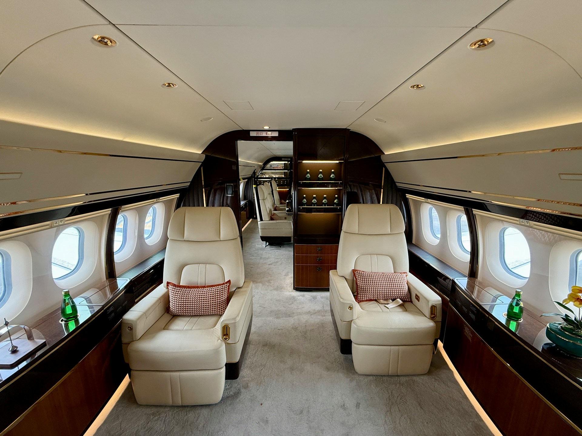
If you own or operate aircraft, the fleet is the product. Yet on most private jet website designs, the fleet is a single page of tail numbers with a passenger count and a stock cabin photo that could belong to anyone.
Our opinion: every aircraft deserves its own page — specs, real photography, range, cabin, and an inquiry tied to that specific tail number. That's not decoration. It's how a serious client self-qualifies before they ever call, which means the conversations that follow are with people who already chose. A fleet presented as a catalog to browse converts better than a fleet buried behind a form.
Sign 3: It looks like every other charter site
This is the contrarian one, and it's the one nobody wants to hear. The dark background, the hero video of a jet at golden hour, the phrase "elevate your journey" — the entire category borrowed the same visual language, so every operator now looks identical.
Our opinion: in a market where everyone looks the same, looking the same is the risk, not the safe choice. A private aviation brand that copies the category signals that it is one of many. The operators winning the best clients are the ones whose sites are quieter, more specific, and more confident than their competitors'. Restraint reads as a brand that doesn't need to shout. We built the Hudson Jets membership site to do exactly that — minimal, typographic, and organized around the membership, not the clichés.
The uncomfortable truth: if your site could have your competitor's logo dropped onto it without anyone noticing, you don't have a brand. You have a template.
Sign 4: It's slow, and it wasn't built for a phone
A meaningful share of private aviation inquiries now start on a phone, often minutes before a trip. If the site takes four seconds to load and the quote form is unusable on mobile, you've lost the client to whoever's site worked.
Our opinion: speed is a luxury signal, not a technical detail. The clients private aviation wants are the ones whose time is expensive. A slow site tells them you don't respect it. We build every site to load in about a second and to work first on the device the inquiry comes from. When your product is saving people time, a slow website is a contradiction the client feels immediately.
Sign 5: Nobody can tell what you are
Private aviation is full of different businesses that all use the same words. A charter broker, a charter operator with an owned fleet, an FBO, a membership club, and an aircraft management company are five different offers — and most of their websites are indistinguishable.
Our opinion: your site should make your category obvious in the first sentence, because the wrong framing attracts the wrong clients. An FBO whose advantage is its location should not open like a broker chasing a quote — a point we made in detail in why FBO operators need a different website than charter brokers. When we work with ARM Charter at Teterboro, Reliance with its owned fleet, or a membership club like FLY1200, the structure of each site is different from the first wireframe, because the businesses are different. A site that blurs what you are will fill your inbox with inquiries you don't want.
A 60-second self-audit
You don't need an agency to spot most of this. Open your own site on your phone, as if you were a client who just got your name from a friend, and check five things.
Does the fleet or a form load first? If it's the form, you're leading with price. Can you reach a specific aircraft in one tap? If not, the product is buried. Could a competitor's logo sit on your homepage unnoticed? If yes, you have a template, not a brand. Does it load before you lose patience? If you're waiting, so is the client. Is it obvious in the first line whether you're a broker, an operator, an FBO, or a club? If you have to scroll to find out, so does everyone else.
Our opinion: two or more of those is enough to justify a rebuild. Not because the current site is ugly, but because each one is quietly re-pricing you downward every day it's live.
What this really costs you
Here is the part operators underestimate. A dated website doesn't just underperform — it re-prices you. The same charter, quoted by an operator with a sharp site and one with a 2015 template, reads as two different tiers of service to the client. One looks like a premium operation. The other looks like it competes on price, so the client expects to negotiate.
In three years of building private aviation sites, the pattern we see is consistent: the website isn't the marketing. It's the first proof of the operation. It either confirms that a referred client made a good decision, or it quietly undermines the referral before the first conversation.
If your site is doing the second thing, that's a fixable problem. You can see our aviation work, or send us your current site and we'll tell you, plainly, which of these five it's doing.
Frequently asked questions
What makes a private aviation website effective?
Clarity about what you are, a fleet presented as the product rather than a form, fast mobile performance, and a brand that doesn't look like every other charter site. The site's job is to confirm trust before the first call, not to capture a lead in the first three seconds.
Should a charter operator's website lead with a quote form?
No. If you own or operate aircraft, leading with a quote form frames you like a broker and throws away your advantage. Lead with the fleet and let the form come after the client has a reason to trust you. We rebuilt Reliance Jets on exactly this principle.
How much does a private aviation website cost?
At beterdesign, website design starts at $3,000 and a full brand-and-website engagement at $7,000. A complete private aviation site usually runs $15,000 to $50,000 once brand identity, photography direction, and content are included.
Who designs websites for private jet and charter companies?
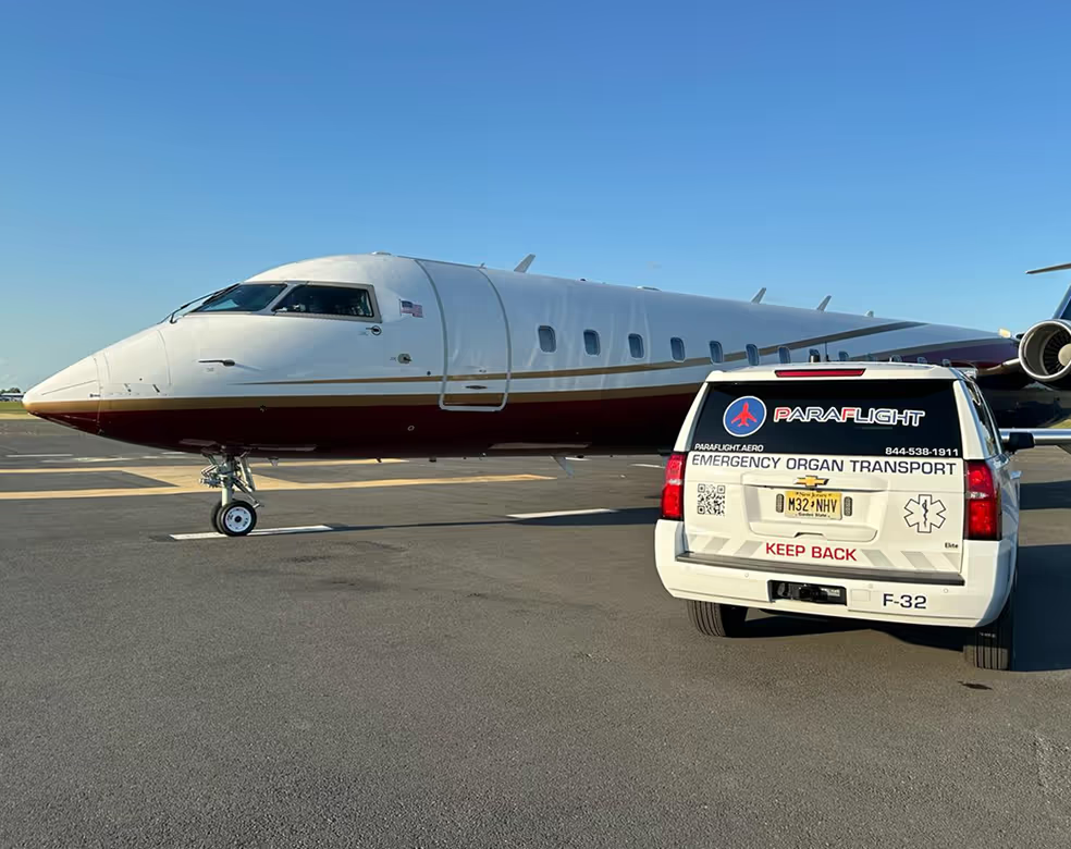
beterdesign is a private aviation website design agency. We've built for six aviation brands — Hudson Jets, JetSet GRP, Reliance Jets, Paraflight, ARM Charter, and FLY1200 — several in partnership with N5 Marketing Inc.
If you're an operator, FBO, or membership club and your site is showing two or more of these signs, that's the moment to fix it. Send it over and we'll give you a straight read.

.svg)