Rival Aviation: a private charter brand with no icon, no crest and no jet
Rival Aviation is a private charter platform built on transparent pricing and straight answers. We started with the brand: a purely typographic wordmark, a night-navy palette and one gold accent. The website comes next.
This article is available in English.
Rival Aviation is a private charter platform for people who move faster than the industry built to serve them. Its promise is transparent pricing, real empty-leg deals and straight answers, where traditional brokers trade on opacity.
We are building it in the right order: the brand first, then the website. This is the first part of that work.
One idea: effortless command
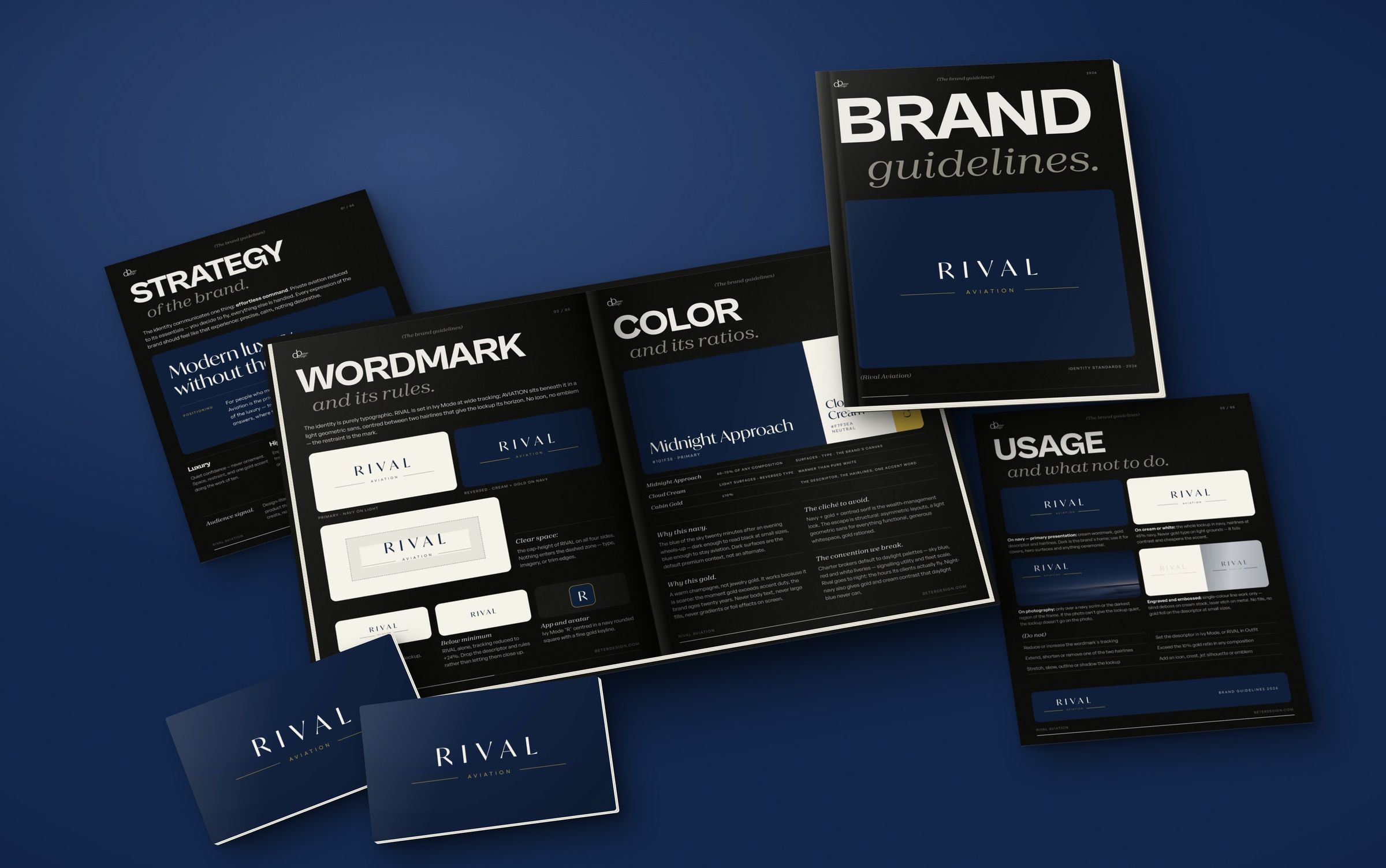
The identity communicates one thing: effortless command. Private aviation reduced to its essentials. You decide to fly, and everything else is handled. Every expression of the brand should feel like that experience: precise, calm, nothing decorative.
The audience is design-literate, digital-first and short on time. So the identity reads like a premium product they already use, closer to a flagship automotive marque than a legacy broker. The guidelines open with the line that sums it up: modern luxury, without the ceremony.
A wordmark and nothing else
The identity is purely typographic. RIVAL is set in Ivy Mode at wide tracking. AVIATION sits beneath it in a light geometric sans, centred between two hairlines that give the lockup its horizon.
There is no icon, no emblem and no jet silhouette. The restraint is the mark. When there isn't room for the full lockup, RIVAL stands alone. On a phone, the app icon is a single Ivy Mode R in a navy rounded square with a fine gold keyline.
Going to night
Charter brokers default to daylight palettes: sky blue, red and white liveries that signal utility and fleet scale. Rival goes to night, the hours its clients actually fly.
- Midnight Approach (#101F38) is the blue of the sky twenty minutes after an evening wheels-up, and takes 60 to 70 percent of any composition.
- Cabin Gold (#D4AF37) is a warm champagne, kept to 10 percent or less: the descriptor, the hairlines, one accent word. It works because it is scarce.
- Cloud Cream (#F7F3EA) carries light surfaces and reversed type, warmer than pure white.
Navy, gold and a centred serif can easily slide into the wealth-management look. The escape is structural: asymmetric layouts, a light geometric sans for everything functional, generous whitespace, and gold rationed.
Two typefaces, two jobs
Ivy Mode appears only where the brand speaks: the wordmark and the headlines. It comes in one weight, because lightness, not boldness, is the authority cue. Outfit, in Light and Regular, does everything else: the descriptor, the interface, captions and running text.
The guidelines also say what never to use: script or calligraphic faces, rounded and friendly ones, condensed sans, and bold or heavy weights anywhere in the identity.
Rules for the real world
An identity this quiet depends on being used properly, so the guidelines cover each surface. Navy is the primary presentation. On cream or white the whole lockup goes navy, never gold. On photography it sits only over a navy scrim or the darkest part of the frame, and if the photo can't give it quiet, it doesn't go on the photo. Engraving and embossing are single-colour line work.
We mocked it up where a charter brand has to live: terminal signage, stationery, an app icon and a website hero.
Next: the website
The website is next, built on this identity. See the Rival Aviation project, or start a project if your brand needs the same order of work.