Beth Keyse: a travel brand that feels personal, not packaged
Beth Keyse plans cruises and European journeys for travelers who care about the details. We wrote down the system behind her brand: the BK monogram, night navy and ivory, one evening gold accent, and Zodiak with Jost.
This article is available in English.
Beth Keyse is a travel advisor who plans cruises, European journeys and thoughtfully planned trips, designed around comfort, connection and the way her clients actually want to travel. She is a Virtuoso Member and a Fora Pro.
She already had the BK monogram and the colors. We built her new website around them, then wrote down the system behind it: these brand guidelines.
One idea: personal, not packaged
The identity communicates one thing: personal, not packaged. The best trips don’t feel like checklists, and neither should the brand. Every expression of it should feel like having someone in your corner: comfortable, thoughtfully paced, never loud.
Her clients are couples, honeymooners and anniversary travelers, families tracing their heritage, and small groups. So the identity reads like a well-kept journal, not a booking engine. The line that opens the guidelines is her own: don’t just observe life, live it.
A monogram and one rule
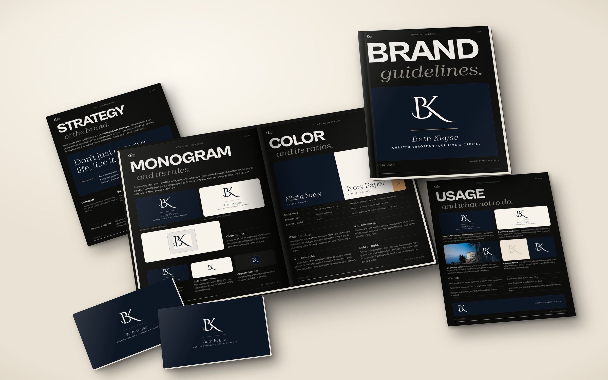
The BK monogram is one calligraphic gesture that carries all the flourish the brand needs. The full lockup adds a single gold rule, Beth’s name in Zodiak italic and her promise in tracked Jost capitals: curated European journeys and cruises.
When there isn’t room, the monogram stands alone, and the rest is dropped rather than squeezed. On a phone it is the ivory monogram on a navy square.
Night, paper and evening light
Night Navy (#0E1824) gives the journal its deep chapters: dark enough to read as black in small type, blue enough to stay a night sky.
Ivory Paper (#F7F3EC) is warm paper, not a white screen. Photographs sit on it like prints in a journal.
Evening Gold (#E9A668) is the last hour of evening light, closer to apricot than to jewelry, and is kept to 10 percent or less of any composition. It fails contrast on ivory, so small type on light grounds moves to Deep Gold (#9C561C).
Two typefaces, two jobs
Zodiak Light appears where Beth speaks: headlines in sentence case, with italic for the one phrase where the voice turns personal. Jost, in Regular and Medium, does everything else: body text, navigation, captions and the kickers in wide-tracked capitals.
The guidelines also say what never to use: all-caps headlines in the serif, script faces beside the monogram, more than one italic phrase in a headline, and bold or heavy weights anywhere in the identity.
Rules for the real world
A travel brand lives on photographs, so the guidelines cover each surface. Navy is the primary presentation. On ivory or sand the whole lockup goes navy, never gold. On a photo the monogram sits only over a navy scrim or the darkest part of the frame. Print is one color only: blind deboss on sand stock, ivory ink on navy stock.
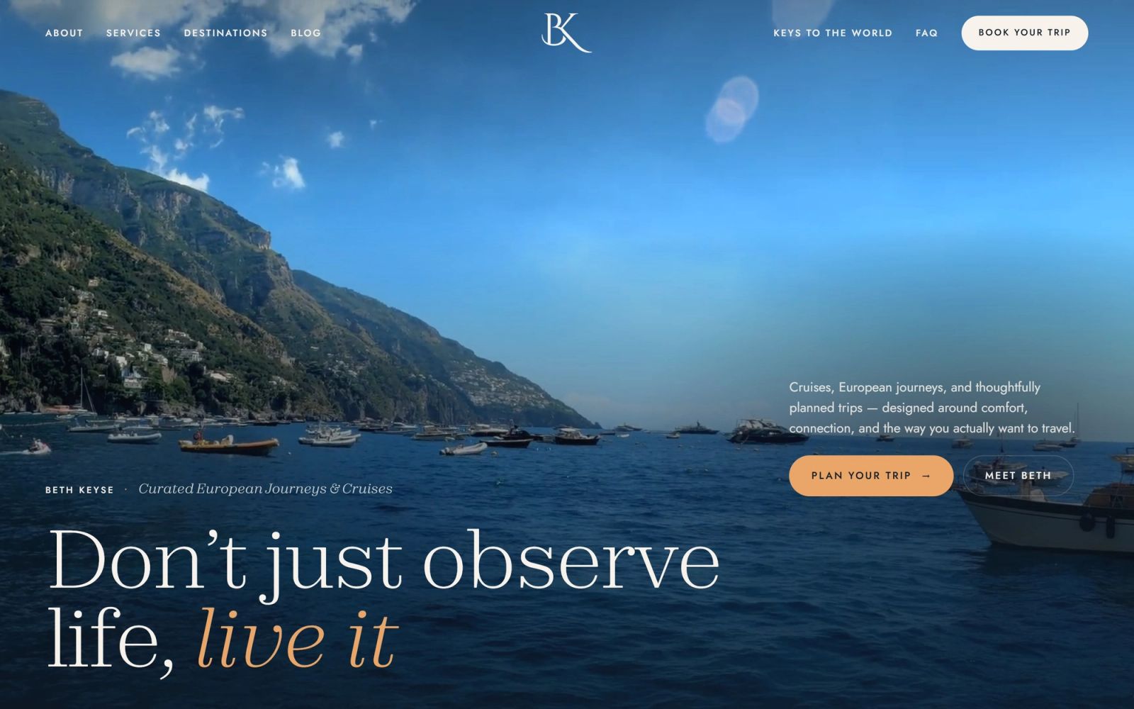
We mocked it up where her work already lives: the website hero, her journal of hotel picks, stationery and her Europe Travel Starter Guide.
See it in use
See the Beth Keyse brand project and the website, or start a project if your brand needs the same.