Jess Powers: a Rhode Island real estate brand, honestly explained
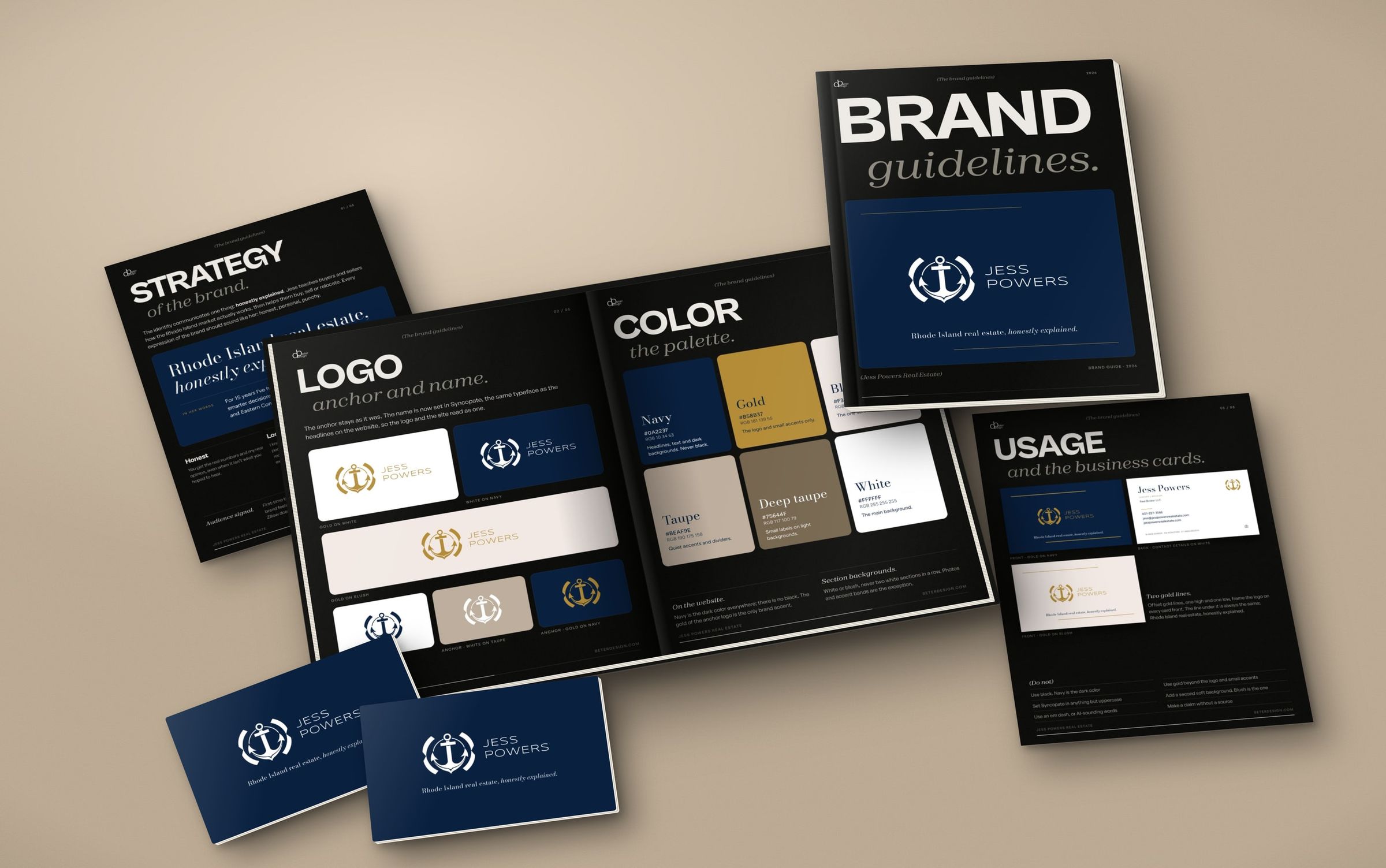
Jess Powers teaches buyers and sellers how the Rhode Island market actually works. Her brand guide keeps the anchor, sets her name in Syncopate, and gives six colors and three typefaces one job each.
This article is available in English.
Jess Powers is a Rhode Island Realtor and the owner and broker of her team at Real Broker LLC, licensed in Rhode Island, Massachusetts and Connecticut. She also teaches: her YouTube channel and blog exist because people make better decisions when they get good information.
Her website set the type: wide Syncopate headlines, Bodoni Moda statements, Figtree for everything else. The logo had to follow, and this brand guide writes the whole system down.
One idea: honestly explained
The brand communicates one thing: honestly explained. Jess teaches buyers and sellers how the Rhode Island market actually works, then helps them buy, sell or relocate. The tone is honest, personal and punchy: short sentences, first person. In her words: Zillow doesn’t know your block. I do.
Her clients are first-time buyers, relocators, Rhode Island homeowners selling, and small investors. So the brand has to feel established and local, not salesy.
The anchor stays
The anchor stays as it was. The name is now set in Syncopate, the same typeface as the headlines on the website, so the logo and the site read as one.
The full logo runs gold on white or blush and white on navy. The anchor alone runs navy on white, white on taupe and gold on navy.
Six colors, one job each
Navy (#0A223F) is the dark color everywhere: headlines, text and dark backgrounds. Never black.
Gold (#B58B37) is for the logo and small accents only.
White (#FFFFFF) is the main background and blush (#F3EAE5) the one soft background color. Taupe (#BEAF9E) handles quiet accents and dividers, and deep taupe (#75644F) small labels on light backgrounds.
Three typefaces
Syncopate sets headlines and the logo, always uppercase. Bodoni Moda carries statements, names and towns, with italic for emphasis. Figtree does body text, labels and buttons. All three are free for commercial use.
Cards and the real world
The business cards put the logo in gold on navy or blush, between two offset gold lines, with one sentence under it: Rhode Island real estate, honestly explained. The back holds her contact details and license numbers on white.
We mocked the brand up where her work lives: the website hero, her area guides, an avatar and her free buyer’s guide.
See it in use
See the Jess Powers project, or start a project if your brand needs the same.