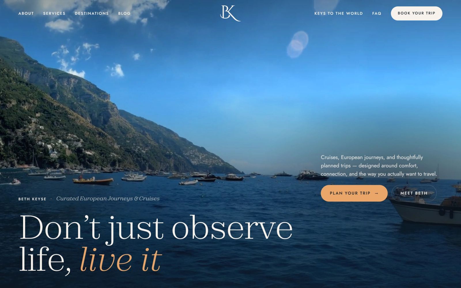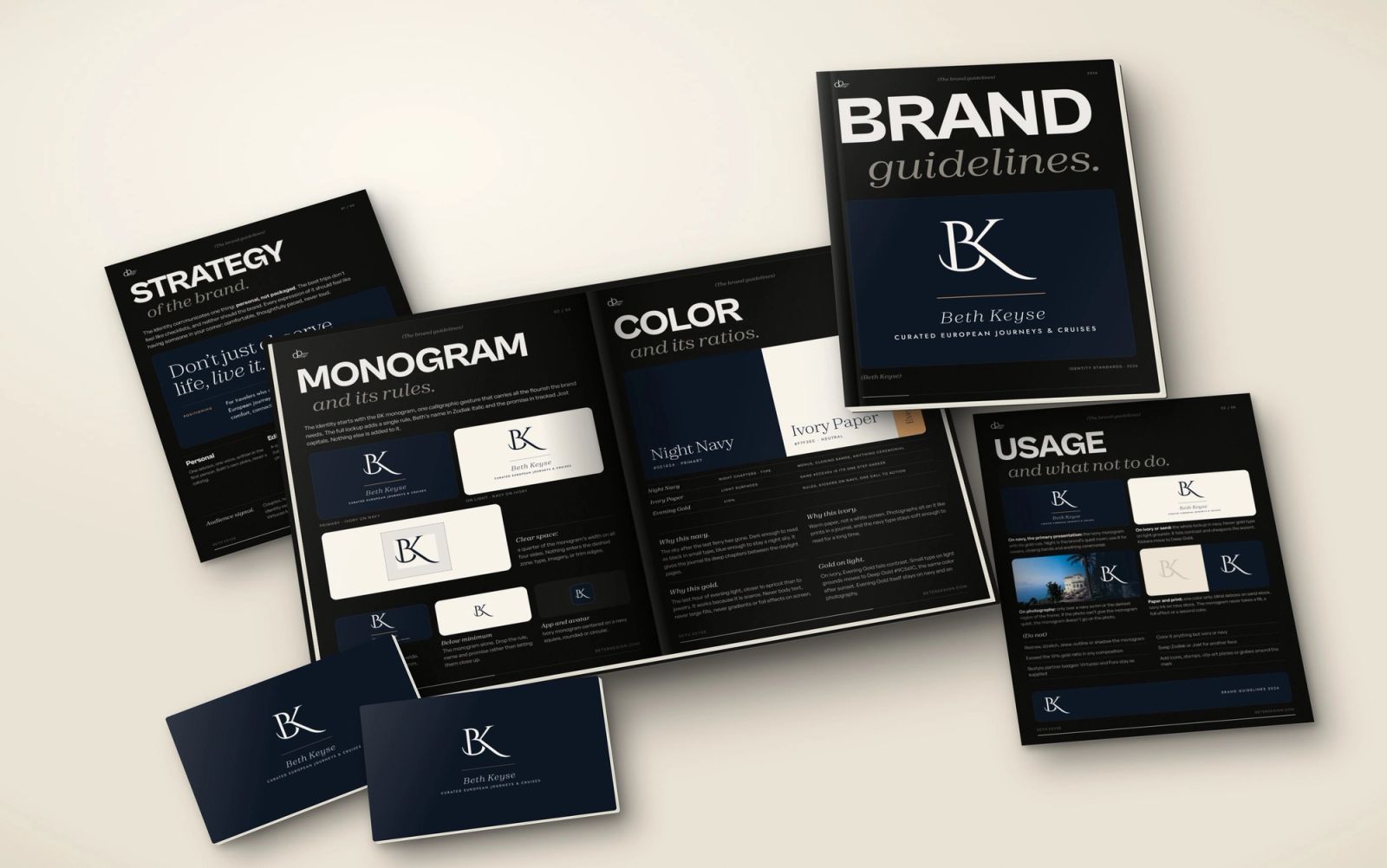
Keys to the World: designing an interactive hotel atlas for a travel advisor
Keys to the World puts every hotel Beth Keyse has written about on one interactive globe. Why a travel advisor's website should be a place to explore, not a brochure.
This article is available in English.
A travel advisor sells judgement: which hotel, which room, which month, which ship. Most advisor websites hide that judgement behind a list of services. For Beth Keyse we asked a different question: what if the writing itself was the way in?
Beth Keyse is a travel advisor who writes about hotels. That sentence is the whole brief, and it is more interesting than it sounds. Her value is not a catalogue of properties anyone can find online. It is that she has been there, formed an opinion and put it in writing. Keys to the World, an interactive hotel atlas on bethkeyse.com, is how we made that visible.
The problem with most travel advisor websites
Open ten advisor sites and you will see the same structure: a hero photo of a beach, a short bio, a list of services and a contact form. It is correct and it is forgettable. A visitor cannot tell what the advisor knows, only that she says she knows it.
For a brand that sells on trust, that is a missed opportunity. Trust in travel comes from specifics: this property, this view, this reason. The site should let a visitor meet that expertise before they ever send a message.
One globe, every hotel Beth has written about
Keys to the World puts every hotel Beth has written about on a single interactive globe. A visitor spins it, picks a key, and reads that hotel's story. From there, a booking door opens when they are ready. The page also includes a keyring for the places a visitor wants to keep, and a way to plan the trip with Beth.
The metaphor does a lot of work. A key is a small, physical thing that stands for access, which is exactly what an advisor offers. The globe replaces a menu of destinations with something a visitor wants to touch.
Design decisions that carry over to any travel brand
- Let the content be the navigation. Instead of asking visitors to choose from a list, give them a map of the work itself.
- Keep the story one step from the booking. A visitor who has just read why a hotel is special is the visitor most ready to ask about it.
- Give people a way to save. A keyring turns browsing into a shortlist, and a shortlist is a much better conversation starter than a blank form.
- Organise by how people dream. Beth's destinations are grouped as Continental Europe, UK and Ireland, and European cruises, which is how clients tend to think about a trip.
Why cruises belong in the same story
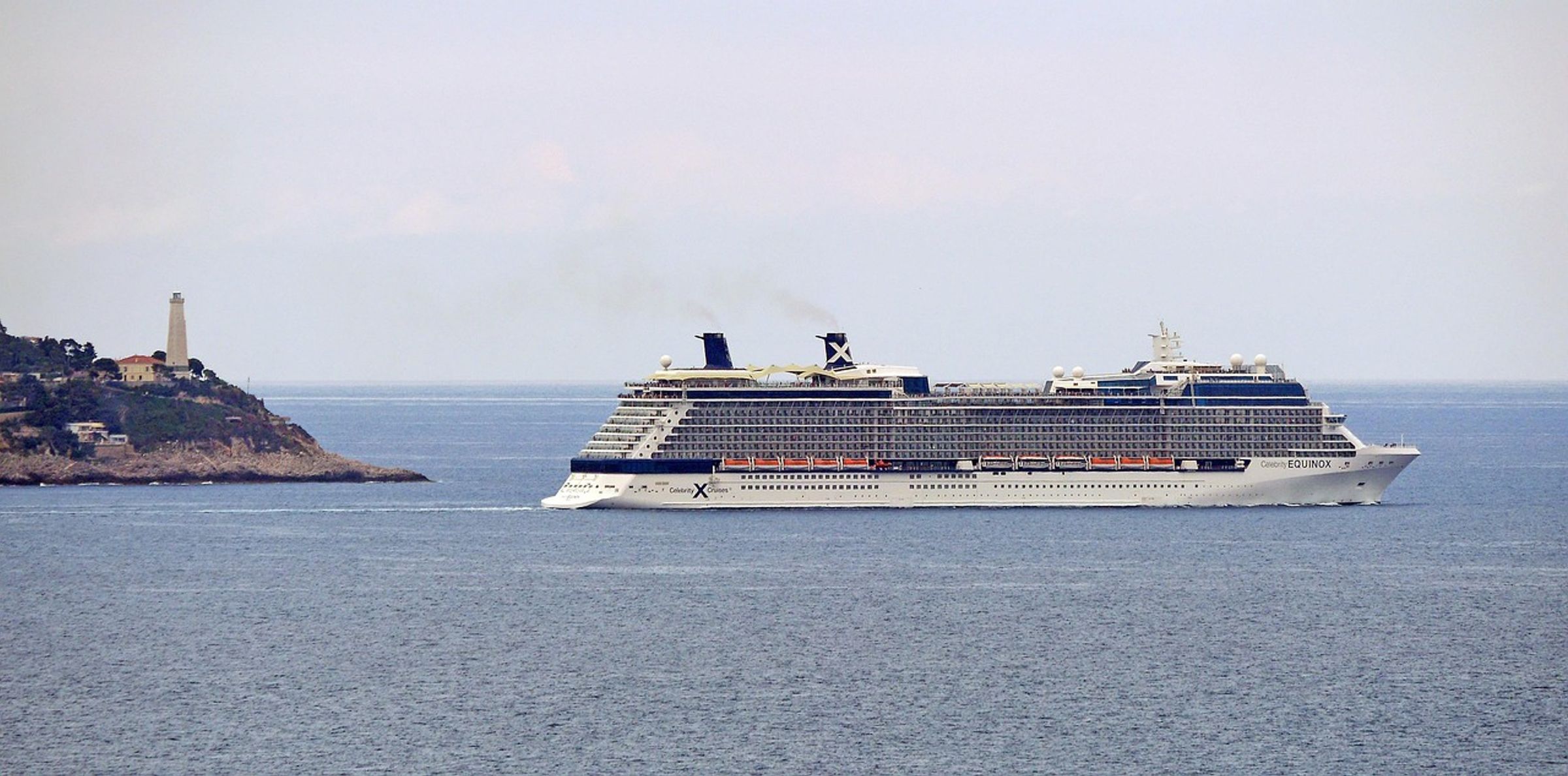
European cruises sit alongside hotels in Beth's destinations, and the design treats them the same way: a place worth explaining, not a product listing. A cruise is a choice about itinerary, ship and pace, and those are things an advisor's experience helps with. Giving that choice the same editorial care as a hotel makes the whole site feel like one point of view. It is the same thinking behind designing a luxury restaurant website.
Make it easy to start
An interactive page is a way in, not the end. Beth's site keeps the next step plain: a travel starter guide for visitors who are early in their planning, a clear route to book a trip, and a simple way for existing clients to ask for a booking link. Each path matches a different state of mind, and none of them requires a visitor to work out where to go. We took the same approach to making a vacation rental brand easier to book.
Findable, not only beautiful
An interactive globe is delightful for people, but search engines and AI assistants read text. That is why the stories behind the keys matter: each hotel is written about in plain words, which gives Google, ChatGPT and Perplexity something specific to quote. The most inventive interface should always sit on top of real, readable content.
What we would tell any luxury travel brand
Your expertise is the product, so show it. If you write, photograph or review, build the site around that work. Make exploring feel like the first step of the trip, keep the booking path short, and let your voice stay as personal online as it is on a call.
You can see the result at bethkeyse.com/keys-to-the-world. If you run a travel, hospitality or real estate brand with expertise that a template cannot hold, tell us about your project and we will show you how we would put it on the page.